Logo Package Ordered: Silver Package
Special Instructions:
The client wants a construction/house logo that will work well on
business cards, stationary and a web site.
Previews are about a third of actual size
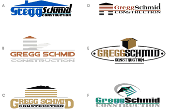
First Set of Concept Designs
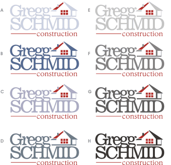
Client likes designs C and F. Likes the way the name is done in both. Doesn't like the house image in C. Likes the house image in F, but it seems too high-tech. Want something less industrial looking. More homey, but not feminine.
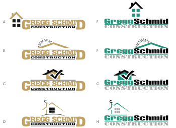
Second Set of Concept Designs
Client is happier with the treatment of the houses in this draft, but feels it's still too industrial. Wants less hard edge, more organic. Wants to see softer fonts.
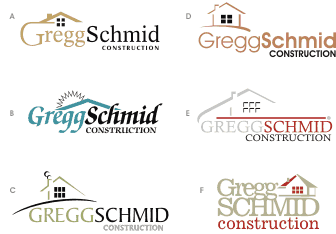
Third Set of Concept Designs
Client likes F and wants to continue with it. Also likes E, but "something about the house just isn't right". Wants to see F with smaller, more toned-down fonts - more like the font in E.
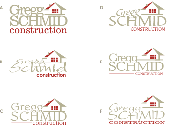
First Round of Revisions
Client wants to stick with the original font (design A), but wants the "construction" from design C, complete with the red line. Client bought a web site template from another design company and wants to see the logo in shades of blue and grey to fit the web site colors. The red must stay.
Second Round of Revisions
Client wants design F as is. No more changes.
The Final Logo

Logo is delivered in the standard formats:
![]() Vector EPS/AI/CDR
Vector EPS/AI/CDR
![]() PDF
PDF
![]() JPG (300 dpi, full color)
JPG (300 dpi, full color)
![]() JPG (300 dpi, black and white)
JPG (300 dpi, black and white)
![]() JPG (300 dpi, grayscale)
JPG (300 dpi, grayscale)
![]() PNG (transparent background)
PNG (transparent background)
![]() GIF (transparent background)
GIF (transparent background)
![]() PSD (layers preserved, 300 dpi)
PSD (layers preserved, 300 dpi)
We can also provide:
![]() TIFF
TIFF
![]() BMP
BMP
![]() SVG
SVG
![]() SWF
SWF
etc... No additional cost for additional formats!
The logo is backed-up in case the client request another copy of one of the above files - or requests the logo in a different format, a different size, on a different color background etc.